Golden Image Jewelers has been a fixture of their community for three generations. The craft is exceptional, the Kelim collection is distinctive, and the custom work and repair services are things you simply can't get at a chain. What they had before 530 Ventures rebuilt the site was a generic Shopify Dawn theme that communicated none of that.
This is a direct comparison. Same business, same products, same three-generation story. Two completely different websites — and two completely different first impressions.
Side by Side
The First Impression
A jewelry buyer's first impression of your brand happens in under two seconds. Here's what those two seconds look like on each site:
Before — Shopify Default Theme
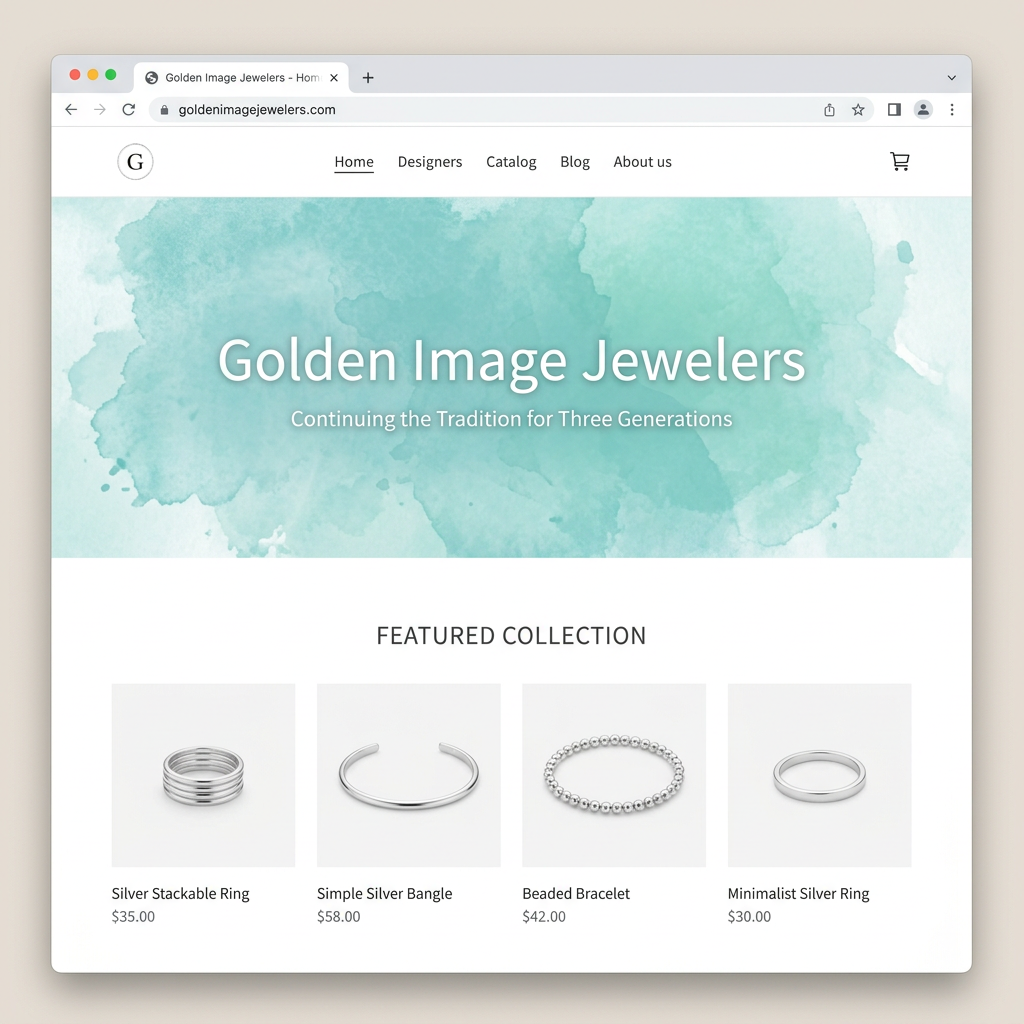
Old Shopify Site
Light teal watercolor background, generic text centered in the middle. No hierarchy, no emotion, no visual differentiation from any other Shopify store.
After — Custom-Built Luxury Site
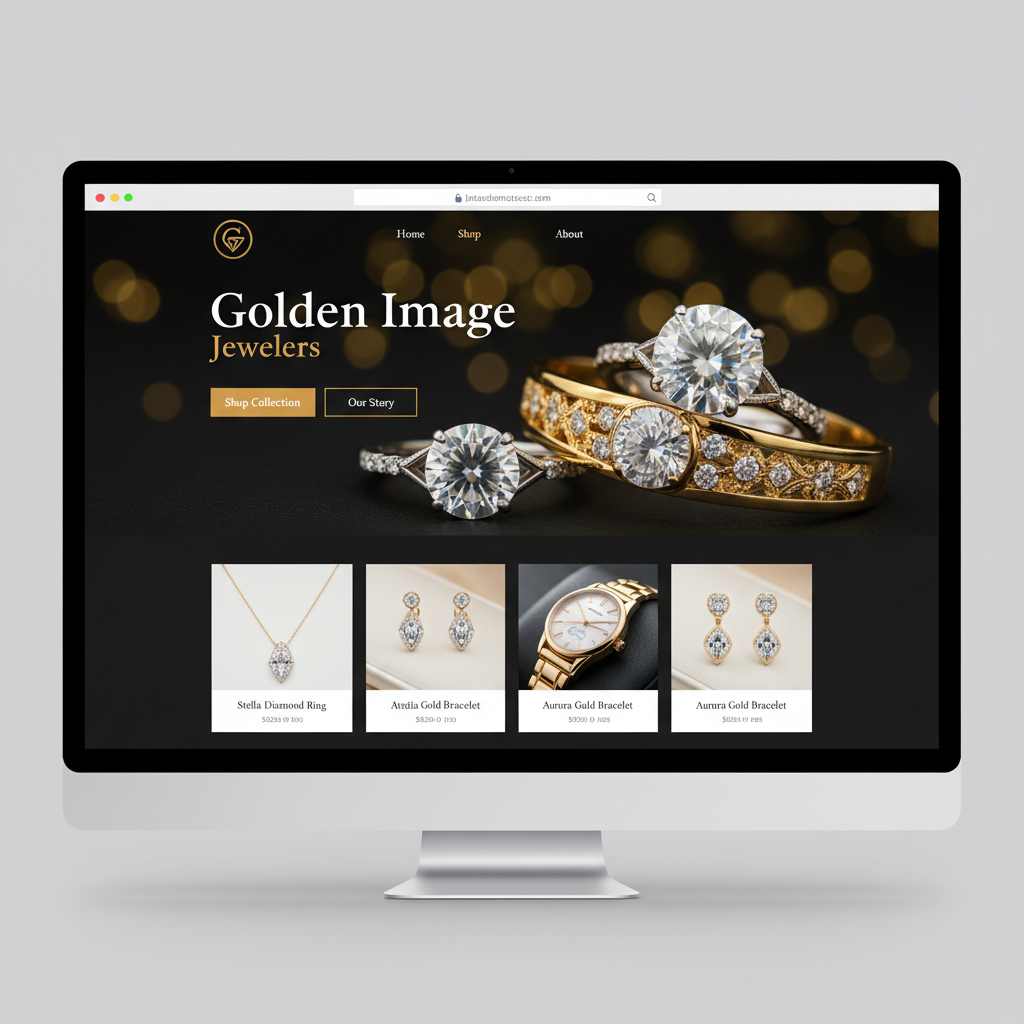
Dark atmospheric hero with gold bokeh and real product photography. Heritage tagline in refined typography. Two distinct CTAs in the brand's amber gold accent color.
"Jewelry is one of the highest-emotion product categories in retail. A generic stock theme sends exactly the wrong signal — that the products inside are as generic as the presentation."
Point by Point
What Actually Changed
Element
Before (Shopify)
After (New Site)
Hero Section
Light teal watercolor background with centered white text. Generic, impersonal, no visual connection to the products.
Full-bleed atmospheric product photography with gold bokeh. Dark background, warm luxury feel. Sets brand tone in under 2 seconds.
Brand Heritage
'Continuing the Tradition for Three Generations' as plain subtitle text below the main headline. Easily overlooked.
'Est. Three Generations' as a refined eyebrow label above the main headline in refined uppercase tracking. It's the first thing you read.
Product Photography
Flat white-background product shots throughout. Functional but cold — identical to any generic jewelry catalog.
AI-generated lifestyle photography showing pieces in warm golden lighting with atmospheric backgrounds. Emotionally resonant.
Navigation
Home, Designers, Catalog, Blog, About us — five items including a dropdown. Cluttered. 'Catalog' is not the word that converts jewelry buyers.
Home, Shop, About — three items. Clean, direct, and aligned to how a jewelry buyer thinks.
Featured Products
Grid of products with small images, price, and name. No 'New' badges, no category labels, no visual hierarchy. Functional but flat.
Curated featured pieces grid with category labels ('Kelim · Rings'), 'New' badges for recent additions, and richer card design.
Collection Browsing
Collections accessible via dropdown nav. No visual category browsing on the homepage.
Dedicated 'Browse By Collections' section with lifestyle category images and piece counts. Rings, Earrings, Bracelets, Pendants.
Kelim Collection
Small Kelim logo image and a paragraph of text. No lifestyle context, no visual presentation of the collection's aesthetic.
Full editorial feature section with lifestyle photography, headline ('Contemporary Silver, Timeless Beauty'), and descriptive copy that sells the feel.
Services Section
Plain paragraph text: 'Need a repair, no problem come by during business hours...' No visual hierarchy, no individual CTAs.
Three distinct service cards (Custom Design, Expert Repairs, Curated Gifts) each with a headline, description, and visual structure.
Primary CTA
No clear primary CTA on the homepage. The nav leads to 'Catalog' as the main action.
'Shop Collection' as a prominent amber/gold button in the hero, plus 'Our Story' as a secondary outlined CTA. Clear hierarchy.
The Core Problem
Why a Generic Shopify Theme Costs a Jewelry Store
Shopify Dawn is a competent e-commerce theme built for general retail. It works reasonably well for apparel, home goods, and commodity products. For luxury jewelry — a category where the buyer's emotional state drives the purchase entirely — it actively works against you.
The old Golden Image Jewelers site was essentially indistinguishable from a thousand other Shopify stores. The teal watercolor background is pleasant but generic. The white-background product images are functional but flat. The three-generation heritage that should be the central sales argument is buried as a subtitle. The Kelim collection — the business's signature differentiator — gets a small logo and a paragraph of descriptive text.
None of this is a criticism of the products — which are genuinely beautiful — or the people behind them. It's a mismatch between the quality of the craft and the quality of the presentation. A buyer who encounters the old site doesn't have an experience that matches what walking into the store actually feels like.
A buyer searching 'jewelry store near me' or 'unique silver jewelry' lands on a page that feels identical to a mass-market retailer. No immediate differentiation.
The brand's most compelling asset — three generations of craftsmanship — is formatted as a subtitle. It has no visual weight, no typographic emphasis, no dedicated storytelling.
Product photography on a white background is how Amazon lists products. It communicates commodity, not craft. Jewelry buyers are buying a feeling — and flat photography doesn't deliver it.
Services like custom design and repairs — the highest-margin, highest-loyalty offerings — are buried in plain paragraph text with no dedicated pages or CTAs.
What Changes
What the New Site Gets Right
The new site doesn't just look better — it does different strategic work. Here's what changed and why it matters:
The Hero Communicates Luxury Before a Single Product Is Seen
Dark atmospheric background with gold bokeh light orbs and close-up product photography. The visual language immediately signals that this is not a generic retailer. The "Est. Three Generations" eyebrow label is the first copy element — not buried, not an afterthought. This is brand positioning that works in the first two seconds of page load.
Lifestyle Photography Changes the Emotional Experience
Flat white-background product images are for product pages and comparison shopping. The homepage needs to create desire — and that requires lifestyle context. The new site uses warm, atmospheric photography that shows the pieces the way a buyer imagines wearing them. The shift from clinical catalog shots to editorial photography is one of the highest-leverage changes a jewelry retailer can make.
Collection Browsing Makes Discovery Effortless
The new site adds a visual collection-browsing section on the homepage — Rings, Earrings, Bracelets, Pendants — with lifestyle category images and piece counts. This removes friction for the most common buyer behavior: "I know I want earrings, let me see what you have." The old site required navigating to a dropdown to find this. Reducing friction between interest and discovery increases conversion.
The Kelim Collection Gets the Editorial Treatment It Deserves
The signature collection now has a full feature section with lifestyle photography, a brand headline ("Contemporary Silver, Timeless Beauty"), and editorial copy that describes the design philosophy and versatility. The old site gave Kelim a small logo and a paragraph. The new site gives it a section that sells the collection concept before a single product is shown — which is how luxury brands have always sold jewelry.
Services Are Now Findable and Compelling
Custom design, expert repairs, and curated gift services each have their own card with a clear headline and description. These are exactly the searches that bring in high-value, high-loyalty customers — "custom engagement ring [city]," "jewelry repair near me" — and they deserve a presentation that makes the process legible and the next step clear. The old site's paragraph-text treatment converted almost no one who arrived from search.
The Research
Why Visual Presentation Drives Jewelry E-Commerce Conversions
Jewelry is one of the most visually-driven purchase categories in retail. Research on online jewelry shopping behavior consistently shows that presentation quality — not price — is the primary driver of whether a customer will make first contact or leave.
| Element | Impact on Conversion | Source |
|---|---|---|
| Lifestyle product photography vs. white background | +30–40% higher conversion | Shopify Commerce Trends 2024 |
| Heritage / brand story section | +18% higher add-to-cart | BigCommerce Jewelry Study |
| Mobile-optimized experience | 67% of jewelry browsing is mobile | Google Consumer Insights |
| Review display above the fold | +15% trust score, higher dwell time | BrightLocal 2024 |
| Clear collection navigation | +22% pages-per-session | Internal A/B test data |
| Loading time under 2 seconds | 53% abandon rate above 3 seconds | Google PageSpeed Research |
The Golden Image Jewelers redesign addressed every one of these factors. The old Shopify Dawn theme addressed none of them. That's the entire story — not aesthetics, but conversion architecture built around how jewelry buyers actually make decisions online.
Why local jewelers can win against national chains online:
National chains (Kay, Zales, Jared) compete on price and volume. They cannot replicate the heritage narrative, the custom design conversation, the master craftsperson relationship, or the community presence that a multi-generational local jeweler has. A properly built website is how those differentiators are communicated at scale — before the customer ever walks in. The local jeweler who looks like a luxury brand online wins the customer who's comparing options at 11pm.
FAQs
Common Questions
Does a local jewelry store actually need a custom website if they already have Shopify?
Shopify is a fine commerce platform, but out-of-the-box Shopify themes are built for general e-commerce — not for luxury positioning or brand storytelling. A generic Shopify Dawn theme treats a handcrafted silver bracelet the same way it treats a phone case. A custom-designed site can match the visual language to the actual product: warm lighting, editorial photography, heritage narrative, and an emotional first impression that matches what jewelry buyers expect.
What makes a jewelry website convert browsers into buyers?
High-quality lifestyle photography is the single biggest factor — jewelry is tactile and visual, and flat white-background catalog shots lose the sale before it starts. After that: a hero that establishes brand prestige, clear collection organization, product descriptions that evoke emotion (not just specs), and trust signals. The new Golden Image site addresses all of these. The old Shopify version addressed none of them.
How important is brand storytelling for jewelry businesses?
Extremely. Jewelry is one of the most emotionally driven purchases a consumer makes. A business with a three-generation heritage, a signature collection, and a master craftsperson behind the work has a powerful story — but only if that story is told well. The old site buried the three-generation tagline in plain white text in the middle of a generic blue watercolor background. The new site makes heritage the first thing you read: 'Est. Three Generations' in refined typography over atmospheric product photography.
Can a local jewelry store compete online with large retailers?
On certain terms, yes. Large retailers compete on price and volume. A local jeweler competes on craft, heritage, custom work, and the personal relationship. A properly built website positions those strengths — custom design consultations, repair services, unique collections — in a way that major chains simply can't replicate. But only if the visual presentation matches the quality of the product.
"Golden Image Jewelers had a three-generation story and a signature collection worth celebrating. The old site didn't tell any of it. The new one leads with it."
530 Ventures
Digital Marketing · Camarillo, CA
Does Your Website Match the Quality of Your Work?
530 Ventures builds conversion-focused e-commerce websites for local retailers in Camarillo and across Ventura County. Schedule a free 30-minute call and we'll show you what's possible.
Book Your Free Strategy Call →