Creative Direction / Film Poster / Project Development

Bringing Quarter Man to life on the page.

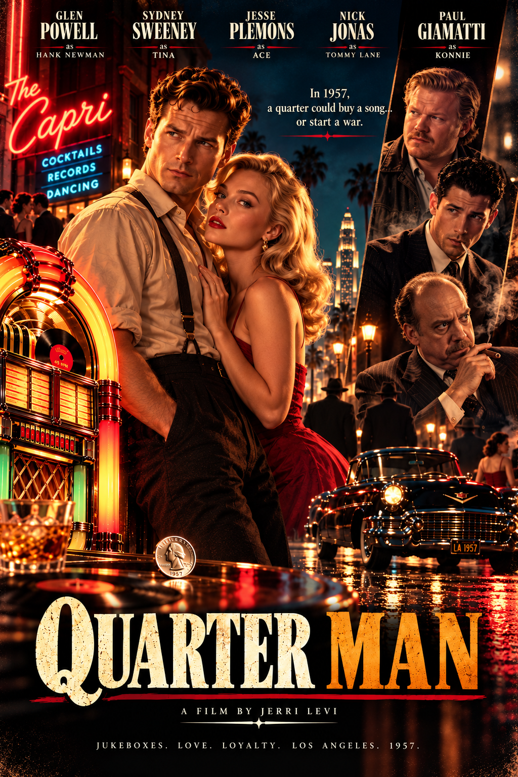
A cinematic poster for Jerri Levi's 1957 Los Angeles crime story—built to communicate the world, the characters and the stakes before a single frame is filmed.

530 Ventures developed the visual direction and concept key art, refined the speculative casting presentation, and helped position the project for conversations with independent film producers.

Project
Quarter Man
Screenwriter
Jerri Levi
Story setting
Los Angeles · 1957
Scope
Concept key art & pitch support
Quarter Man concept film poster: neon 1957 Los Angeles nightlife, jukebox, period car and a speculative ensemble cast
Concept key art for an unproduced screenplay. Actors shown are fantasy casting references only; no talent attachment or endorsement is implied.

The Brief

How do you sell the feeling of a movie that hasn't been made?

The story begins with a simple premise: in 1957, the owner of a struggling Los Angeles jukebox concession must confront the Mafia or risk losing everything. For the screenplay's first visual identity, the challenge wasn't merely to make something attractive. It was to give a producer a sense of the period, the protagonist, the music and the conflict at a glance.

Jerri's early direction called for jukeboxes in all their glory and the energy of early rock 'n' roll. Just as important was the character of the jukebox operator: a grounded, hard-working man with the toughness of the postwar generation. That contrast became the organizing idea behind the poster.

Our Creative Process

Every detail had a job to do.

From historical visual cues to character hierarchy, the choices were designed to make one piece of artwork carry a much larger story.

01

Start with the screenplay, not the artwork

Screenwriter Jerri Levi's brief was specific: Los Angeles, 1957; a struggling jukebox concession owner; and the threat of organized crime. She wanted the visual world to begin with the jukebox itself, 1950s rock 'n' roll, and the contrast between show-business glamour and the toughness of postwar working men.


02

Give the era a recognizable visual language

We shaped the concept around a glowing jukebox, the neon-lit Capri nightclub, classic cars, wet pavement, and a Los Angeles skyline. Red and amber light create the romance of a night out, while deep shadows and the supporting characters hint at danger. The 1957 quarter at the center of the artwork ties the image directly to the title.

03

Develop characters through a speculative cast

Jerri provided a character-by-character fantasy casting list. We used that creative reference to test how Hank, Tina, Ace, Tommy Lane and Konnie might read together in a single image. The concept helped establish tone and character hierarchy; it is not an announcement of casting.

04

Refine the identity and make it useful in a pitch

The poster evolved through conversations about character choices, composition and billing. We also updated the screenwriting credit to Jerri Levi, consistent with how the screenplay is registered and represented. The resulting visual can accompany a logline and screenplay as part of an early-stage project introduction.

The Visual Story

Rock 'n' roll outside. Trouble just beneath it.

The illuminated jukebox anchors the left side of the design. Behind it, the Capri's neon signage supplies the promise of music, cocktails and a night on the town. A period automobile and luminous street scene place us in mid-century Los Angeles.

The central couple brings romance and aspiration. Three supporting portraits on the opposite side introduce friction. The dark blue, red and gold palette connects both sides without flattening them into one mood.

A quarter—small enough to disappear in your pocket, meaningful enough to run the jukebox—became the emblem between the people and the film's title. The final tagline makes that tension explicit: “In 1957, a quarter could buy a song... or start a war.”

Poster details

Jukebox first

The music business is a visible part of the world, not an afterthought.

A particular time and place

Neon signs, a classic car and 1957 Los Angeles set the stage.

A cast of characters

Romance, loyalty and organized crime share a single composition.

Title-led composition

The quarter motif and oversized distressed typography make the concept recognizable.

Casting as a Creative Reference

Making the characters feel real.

To explore the film's tone, Jerri put together a fantasy casting shortlist. We translated five of those character references into the ensemble poster. This was an art-direction exercise intended to make the screenplay easier to picture, not a casting deal.

Hank Newman

Visual reference: Glen Powell

The hard-working jukebox operator at the story's center

Tina

Visual reference: Sydney Sweeney

Old Hollywood glamour, grounded in the period

Ace

Visual reference: Jesse Plemons

Street-smart energy and an unpredictable edge

Tommy Lane

Visual reference: Nick Jonas

A charismatic, sharply dressed presence

Konnie

Visual reference: Paul Giamatti

A distinctively tough wise-guy silhouette

All names and likenesses in the poster are part of a speculative visual concept. None of the actors is represented as cast, involved in, sponsoring or endorsing the project.

Beyond the Poster

Designed for a real conversation with producers.

We didn't treat the artwork as a standalone decoration. As the poster took shape, 530 Ventures also began introducing Quarter Man to independent producers and film contacts ahead of the October 2026 Austin Film Festival. The outreach paired a succinct description of the screenplay with a clear invitation to learn more.

We worked with Jerri on how to present the project: the logline, a memorable visual, digital materials for follow-up and physical copies of the screenplay for in-person conversations. The artwork was meant to earn a second look and give those early discussions a recognizable identity.

This is still an independent project in development. The achievement documented here is the finished concept poster and the producer-facing groundwork—not a completed film, confirmed cast or financing agreement.

The Deliverable

One poster. A clearer picture of the film.

The final concept brings the screenplay's era, mood and key characters into one visual. It also gives Jerri a tangible piece of the project to share when discussing its potential with producers and collaborators.

Cinematic key art

A complete portrait-format movie poster concept.

A defined visual identity

Historical detail, character relationships, color and typography working together.

Pitch-ready direction

A cohesive visual to accompany screenplay introductions and producer outreach.